
This framework helps you read, choose, and use type with intention by understanding the parts that shape every letter.
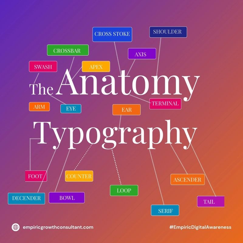
Start by noticing the baseline, axis, and x-height. These define how a letter sits and how balanced or dynamic it feels.
Look at the ascender and descender. These strokes create rhythm and help determine how readable and elegant the type looks.
Focus on elements like the bowl, loop, and counter. These inner and outer forms influence how open, friendly, or bold a typeface appears.
Check the serif, terminal, and tail. These details affect how formal, modern, or expressive the typography feels.
Look at the crossbar, cross stroke, arm, and shoulder. These pieces control how letters connect visually and guide the eye across a word.
Use this understanding to choose fonts that match your brand voice, improve readability, and create stronger visual communication.

Turn your business goals into a clear, focused growth strategy. Work with Empiric Growth Consulting to identify opportunities, overcome growth challenges, and build a scalable path toward sustainable results.